#Fine Arts, Illustration
For a Moment Like a Lonely Island

February 21, 2019
BACKSTORY
This January, in the middle of the cold, brutal winter, I received a most exciting request: Hengtee — a writer I highly respect — requested me to do an illustration for his story!
A little on the man himself: Hengtee Lim is a writer based in Tokyo publishing fiction stories under the pen-name "Snippets". On Medium.com he is a top writer with a growing audience of 14.5K followers.
Quiet, out-of-the ordinary, but always realistic: his stories are like dreams that hide in the everyday*. Sometimes those dreams are colored with loneliness, sometimes cheekiness, but always, they are beautiful.
He builds his stories with obvious craft and care. You can catch a glimpse of his creative process through Twitter, Patreon, and his email newsletters. These posts are not only thoughtful and fascinating, but for me they have acted as a gateway to Japanese literature as well. I highly recommend you check him out.
On to the story: titled "For a Moment Like a Lonely Island," The protagonist outsources all his online messaging to a chatbot, freeing up his time, only later to discover that the chatbot floods his social network with lost connections it's rekindled. Read it! It's quite wonderful.
Once again, find Hengtee here: Medium | Twitter | Patreon | Instagram. Read the story here.
*Or, are they the other way around: flashes of the everyday that hide in dreams? ...It's hard to define someone else's writing. Something is lost in the compression of the experience into words (—guess you'll have to read it yourself, hahaha.)
IDEATION
To be honest, coming up with an idea felt like banging my head against a wall again and again until all the bashing produced something decent. I wanted to do a really good job on this, to make something worthy of a Snippets piece, so I refused to instinctively follow the first idea that came to mind. I'm not so used to drawing figures without reference either, so the many people in the drafts posed some difficulty.I started by listing out some key words:
Technology, messages, two Kens: one friendly, one apathetic.
From which I created a few thumbnails with initial brainstorms:
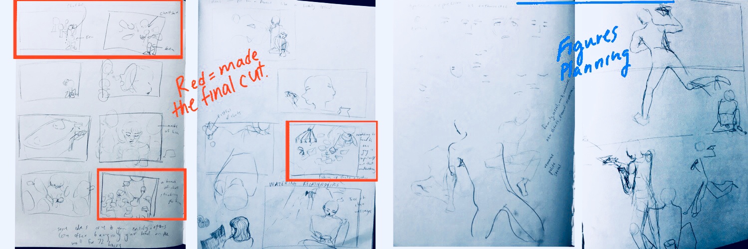
IDEA SELECTION
Here are some of the more 'final' ideas I was considering:
OPENING IMAGE

1 — Chatbot/doppelgänger texting behind Ken’s back to multitudes of people as the real Ken does pottery.
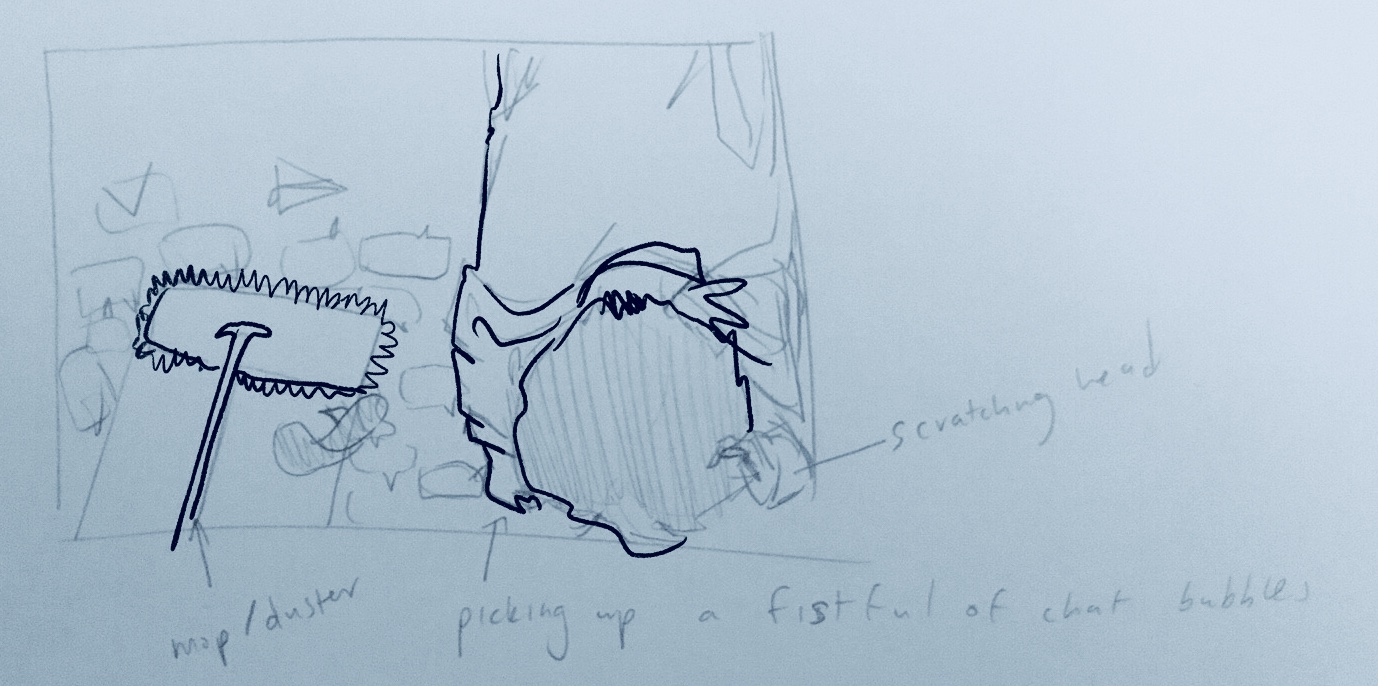
2 — Man picking up chat bubbles off the ground, like fall leaves.
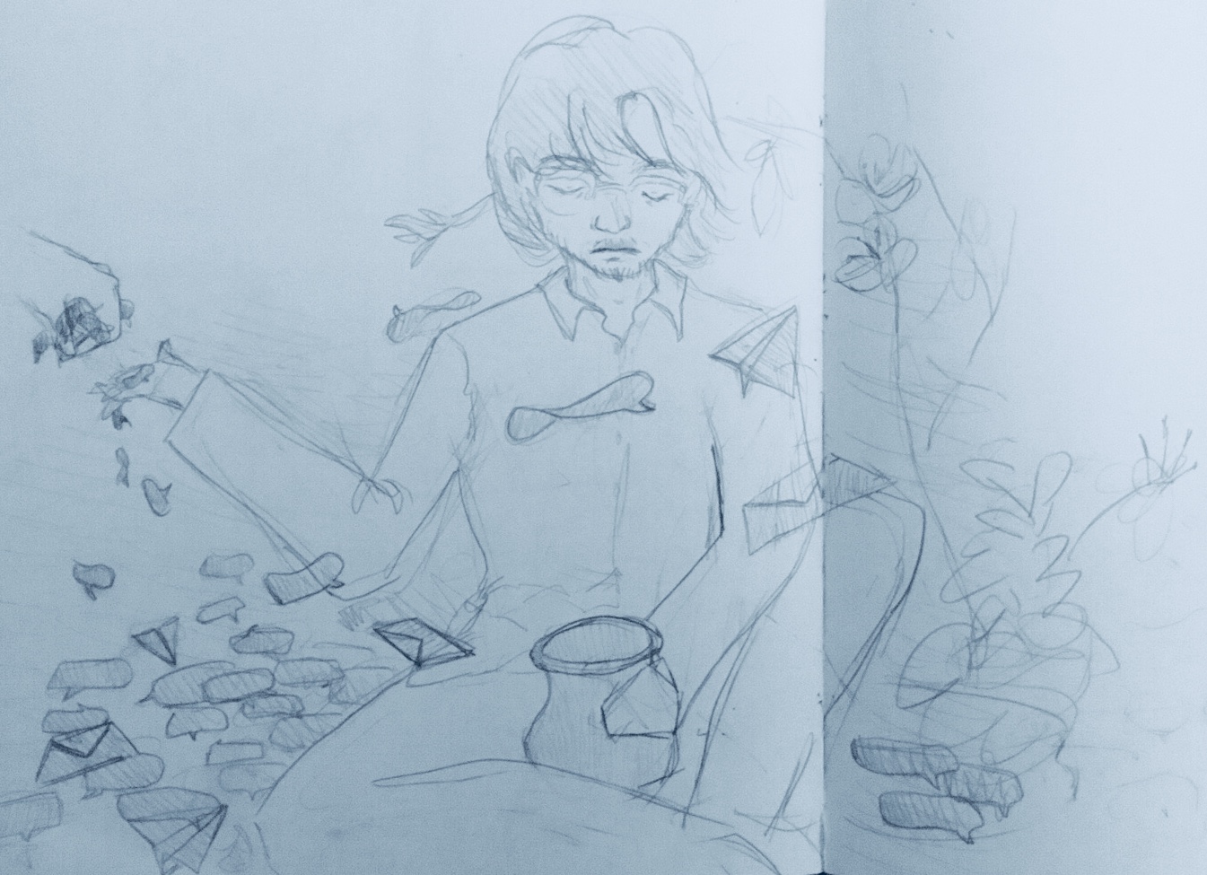
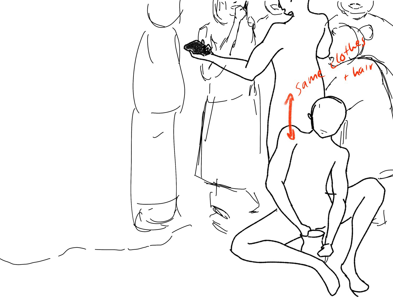
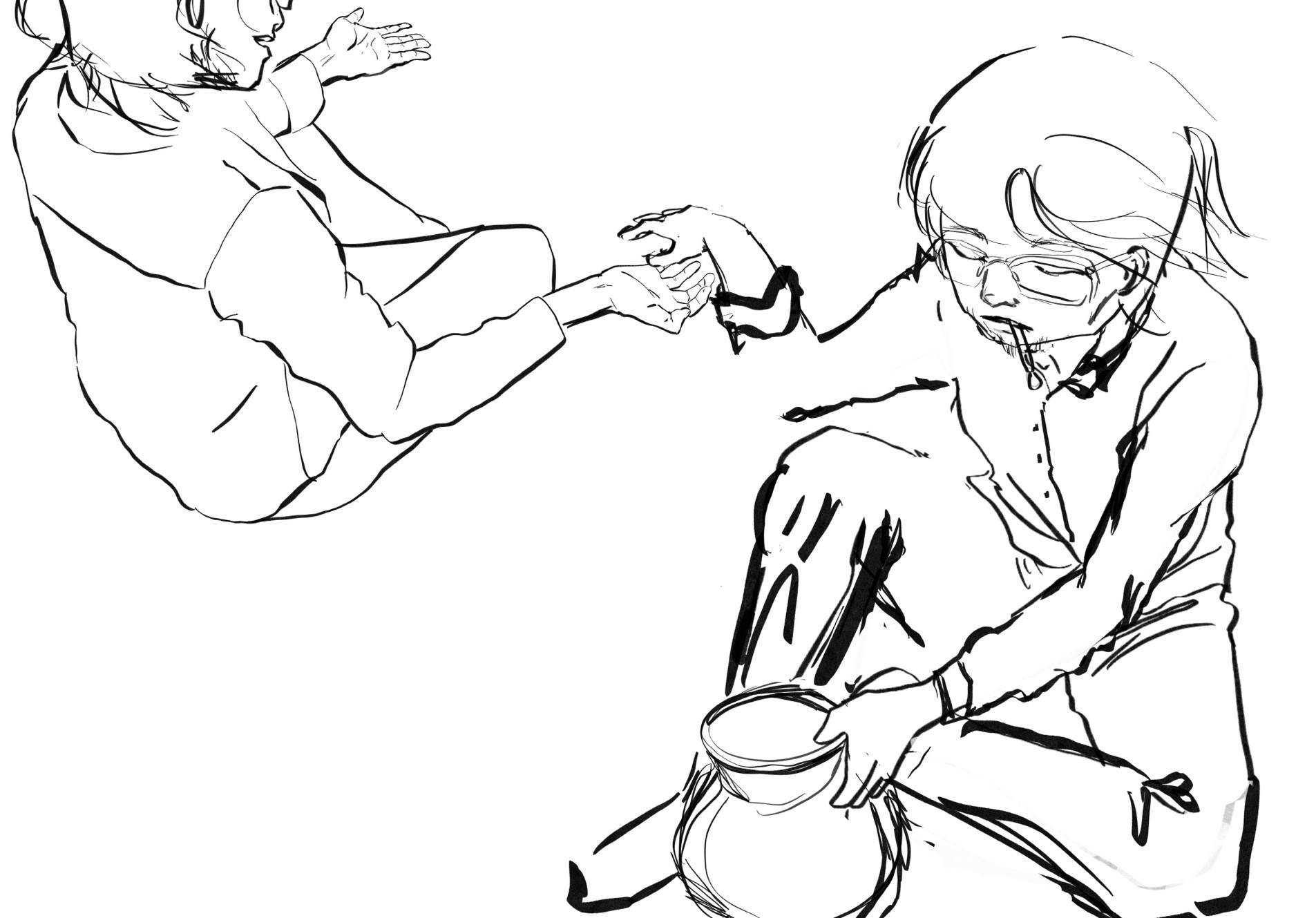
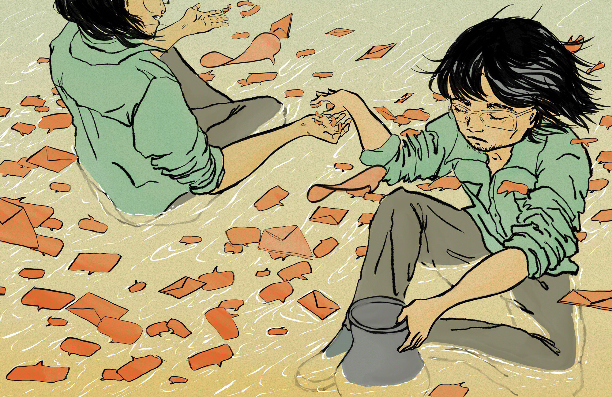
3 — Man handing off chat bubbles to another fist as he does pottery on a sea of chat bubbles+envelopes+paper planes w/ a flower arrangement on the side.
For the character, I chose long hair + glasses because Ken strikes me as a guy who doesn't bother with haircuts, haha.
DECISION
In the end, Hengtee and I agreed on image #3. In his words, "it really shows off the lack of responsibility together with the key imagery in the story (messages)." I liked it because the image is something that you cannot capture in photograph. I think that is the beauty of illustration: the artist has the freedom to break from reality :)
CHANGING ANGLE
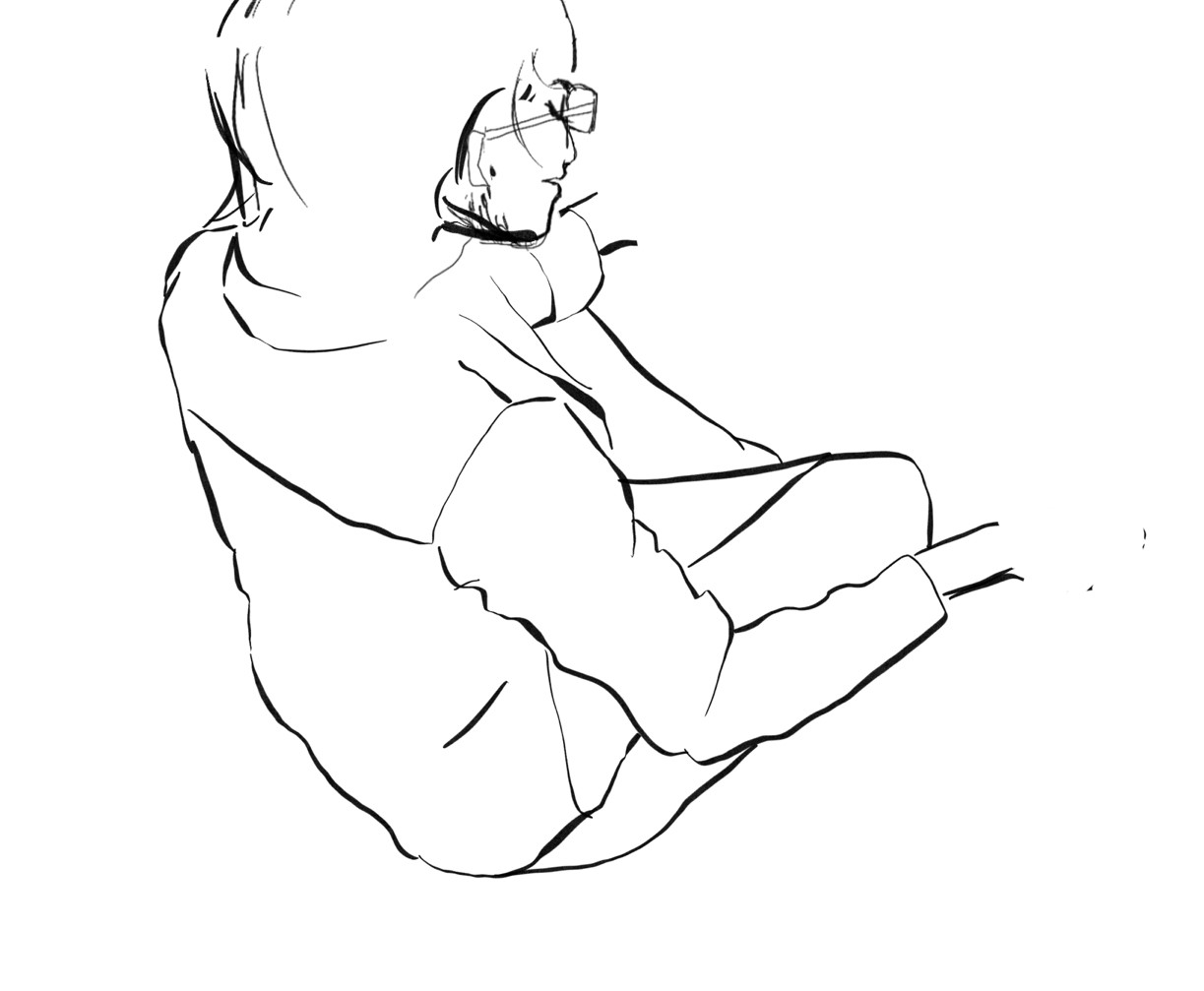
For the sake of churning out as many ideas as possible, I tried to minimize the time I spent on the first draft in the ideation and selection stage. For this particular image, that meant making the drawing more flat + drawing only the fist for the second person (because people are hard).Now that the final idea had been decided, however, I needed to change the perspective to make the image more dynamic. I also wanted to add another full-bodied person in the drawing because that is how I envisioned the chatbot: a person that lives in Ken's phone.
Deciding upon angles:
From the Side
From Below
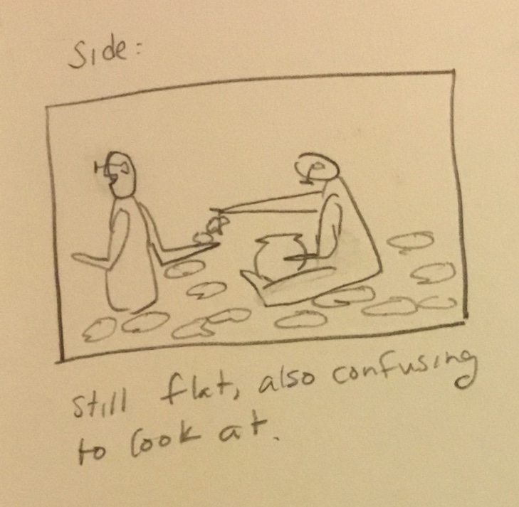
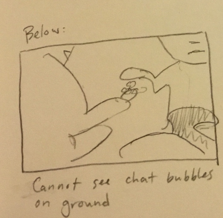
Image still looks flat. Also, confusing to look at.
Cannot see chat bubbles on the ground.
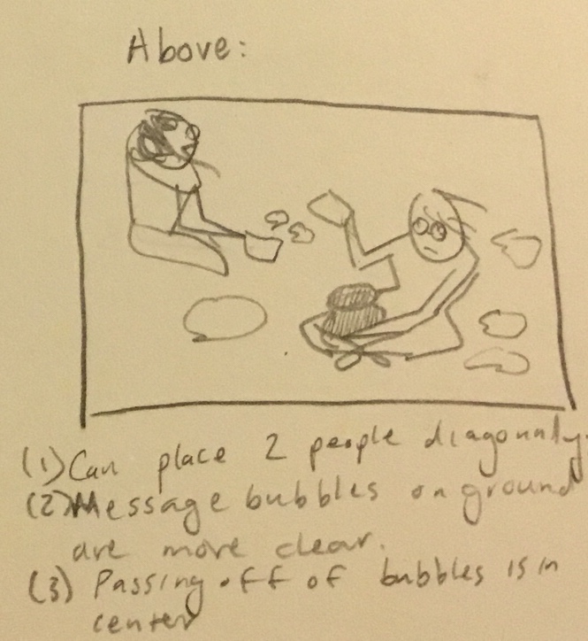
From Above
![]()
(1) Can place 2 people diagonally, making image more dynamic.
(2) Message bubbles on the ground are clear
(3) At the center are two hands passing bubbles.
(1) Can place 2 people diagonally, making image more dynamic.
(2) Message bubbles on the ground are clear
(3) At the center are two hands passing bubbles.
FINE-TUNING + COLOR
From there the final image took shape with minor refinements as it evolved: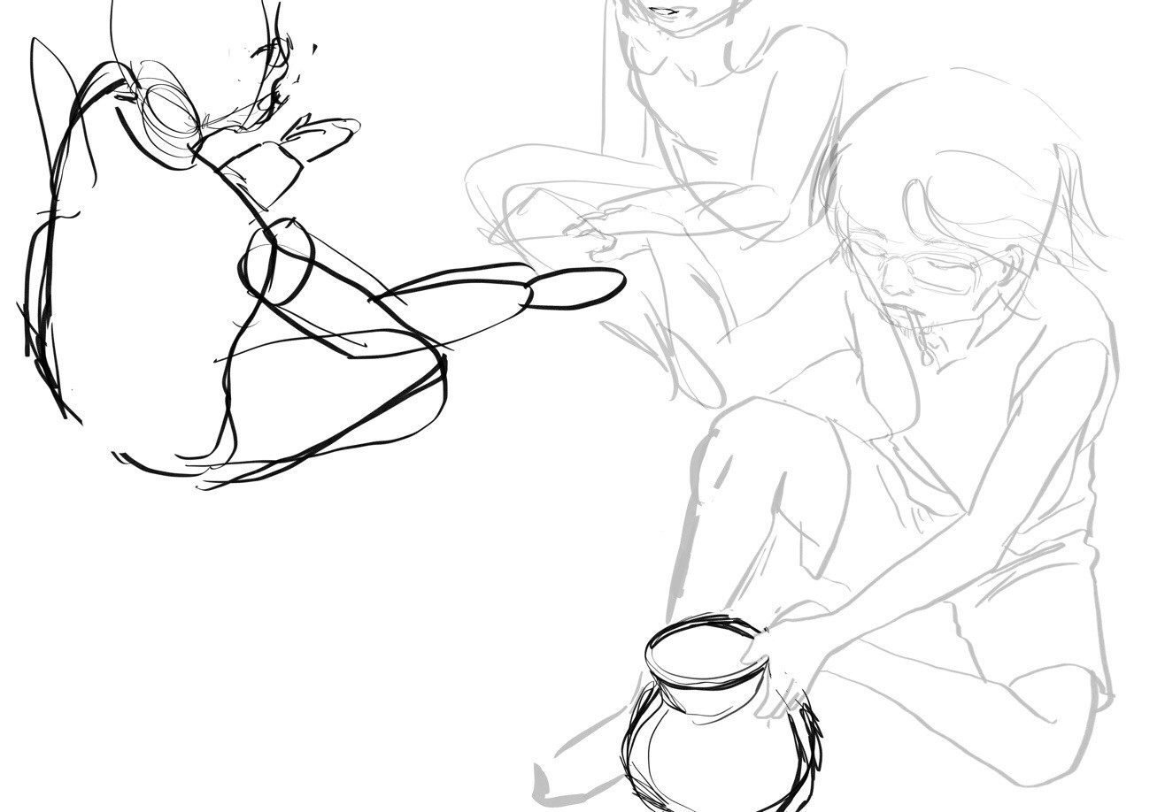
This stage took the most time. Two reasons why:
(1) Human figures are hard! There are few online references photos from this angle. I kept trying to guess how to draw the people before finally using real people as reference models (shoutout to Raymond and Seoyoung -- thank you guys :))
(2) Two parts of the image are physically impossible:
My goal was to make these parts believable. It's illustration—not everything has to be perfectly realistic!
I started drawing the 'bot' with eyes and glasses, but then I cut off the upper half of the face. There are two pros to this:

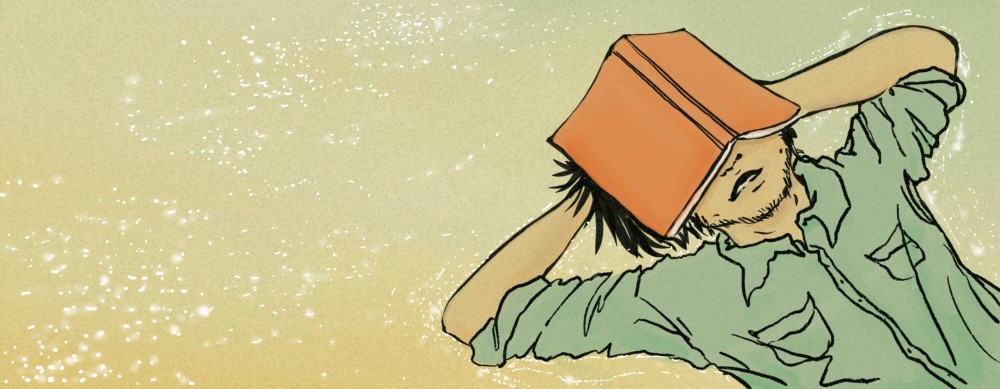
FINAL
I worked on it in snips of time, rather than one sitting, but perhaps that worked out for the best, since new ideas emerged while I wasn't physically working on it.
IN HINDSIGHT
If I were to redo this, I would:1. Keep the outlines, but remove the black color, which is too harsh. It flattens the drawing. Instead I would make the outlines a darker shade of the internal color.
2. Ask for advice on how to draw the water level/line.
3. Make the body language of the 'bot' even more open and casual, with one leg up and the other leg straight and open.
4. Put more thought into the color scheme. In the end, I really chose the colors only because I liked them, not necessarily because they matched the mood of the story.
5. Try to figure out how to make the lines more pleasing/cogent.
CLOSING
Because I look up to Snippets' writing so much, and because I knew a wider audience would be seeing the illustration, I pushed myself a bit harder than usual. The result was a good challenge in ideation, figure-drawing, and decision-making.I'm quite happy with what I've made :)