Team
Mengming Luo: Product Design
Tasha McFarland: Product Design
Phoebe Yan: UX Research
Sanskriti Negi: UX Research
Timeline
May 20 - May 26, 2021
6 days
OVERVIEW
1,000,000,000+
Individuals with Disabilities Worldwide
1,000,000+
Squarespace Users
18,000+
Squarespace Online Stores
PROBLEM
- Thousands of small businesses use Squarespace...
-
yet Squarespace sites lack accessibility support...
- alienating low-vision/blind users.
SOLUTION
- Our team explores features to transform Squarespace into not only a tool that creates accessible sites...
- but also strategically take advantage of its mass user base...
- to turn it into an entrypoint for accessibility awareness within the wider web ecosystem.
WATCH OUR VIDEO SUMMARY
CONTEXT
6
4
1st
This project took place in Design Frontiers, an annual designathon run by UCSD Design Co. As a team of 4, we had a total of 6 days to rapidly:
🔎 Needfind → 💡 Ideate & Validate → ✏️ Prototype → 💻 User Test → 🔄 Iterate → 🎤 Pitch our Project to Fjord Industry Judges
RESULT
After 6 days of rapid sprinting, we presented our project to industry judges from Fjord. To our surprise we won first place! We chalk our win up to a mix of strategy, design, and the individuals in the low-vision/blind communities whose insights carried us forward.
INSPIRATION
DIALOGUE WITH ACCESSIBILITY ADVOCATE
PRIMARY USER RESEARCH: Jimmy
As a part of a web accessibility project at UCSD, I (Mengming) had ties with Jimmy — the university disabilities specialist, and member of the low-vision/blind community.
The project began in dialogue when he mentioned a major insight of his: thousands of websites are created with content management systems (CMS), yet navigating those websites with a screenreader is a major frustration.
He cited his own experience with Squarespace and provided a demonstration with his screenreader, showcasing the many obstacles.
PRIMARY USER RESEARCH: Jason
For additional user research, we interviewed Jason, a system developer who had been blind since birth. During the primary user interview, he explained how he does his daily work through a screenreader, emphasizing that often he requires the aid of his sighted partner to navigate sites with accessibility issues.
IDEATION
We ideated 3 potential approaches:

Browser Extension
A browser extension to describe images and alt text, either with machine-generated text or crowdsourced captions, similar to plug-ins such as a11y and hypothes.is.
Pro's:
- Can address issues across multiple sites, not just sites created with a specific CMS like Squarespace, etc.
Con's:
- Without prior awareness of accessibility, users have little incentive to seek out a browser extension
- Difficult to address accessibility issues beyond alt text.
- Is a retroactive fix, rather than a part of the site design process itself.

Design a New CMS from Scratch: Build from scratch a competitor CMS to Squarespace, Wix, Weebly, etc.
Pro's:
- Presents the opportunity for accessibility improvement on the creator AND consumer side.
Con's:
- Does not address the thousands of websites already created through Squarespace
- Squarespace already has gathered a mass user base
Redesign Squarespace:
Integrate accessibility awareness and checks into the already existing Squarespace interface.
Pro's:
- Squarespace has a large pre-existing user base (over 1 million users).
- Thousands of pre-existing small business already employ Squarespace.
Con's:
- Little opportunity for accessibility improvement on the creator-side.
Ultimately, we chose to redesign Squarespace. Why?
Though the browser extension and new CMS both have their advantages, neither options would be easily discoverable in competition with Squarespace’s mass user base, and neither address the thousands of sites already created with Squarespace.
In addition, as a prominent CMS service, Squarespace sets an example for other CMS companies, modeling whether or not accessibility is worth prioritizing.
Overall, with its massive user population, Squarespace’s popularity makes it a major leverage point for social change within the wider web ecosystem.
GOALS
1. ACCESSIBILITY: Make SS (Squarespace) sites easier to navigate for screenreader users
2. LEARNING: Allow site creators to learn from accessibility mistakes, immediately.
3. EMPATHY: Make the low-vision/blind user’s experience more tangible for sighted users through videos of the actual screenreading experience.
FEATURES
We designed checks for undescriptive links, alt text, missing heading levels, contrast, and more. Features fell into three general categories:
1. Proactive Education
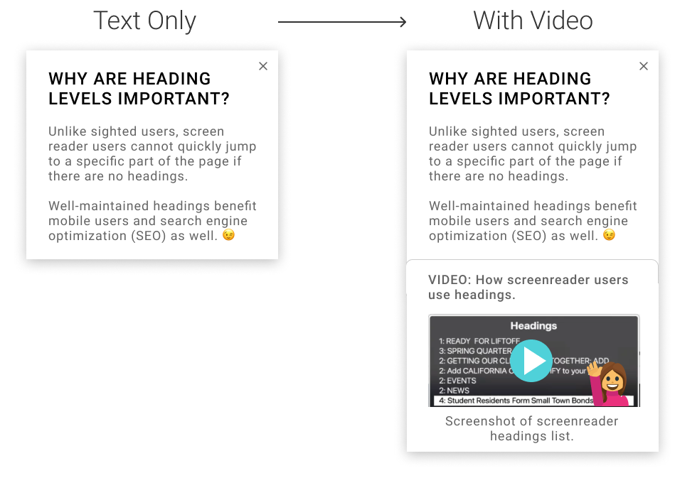
Since many sighted users lack a mental model of how screenreaders work, to help build awareness and education, we baked in tips and videos throughout the interface.
For example: “Heading Levels” checker
In our example Heading Level checker, we include:
1. A description of what heading levels are,
2. A description of why they are important, and
3. A video showing a screenreader user interacting with headings,
So the user can identify and fix their mistakes.
2. Auto-Check
Accessibility is easier to manage in bits throughout the design process, as opposed to one giant retro-active fix at the end. Auto-check automatically detects accessibility issues and prompts the user to make changes.
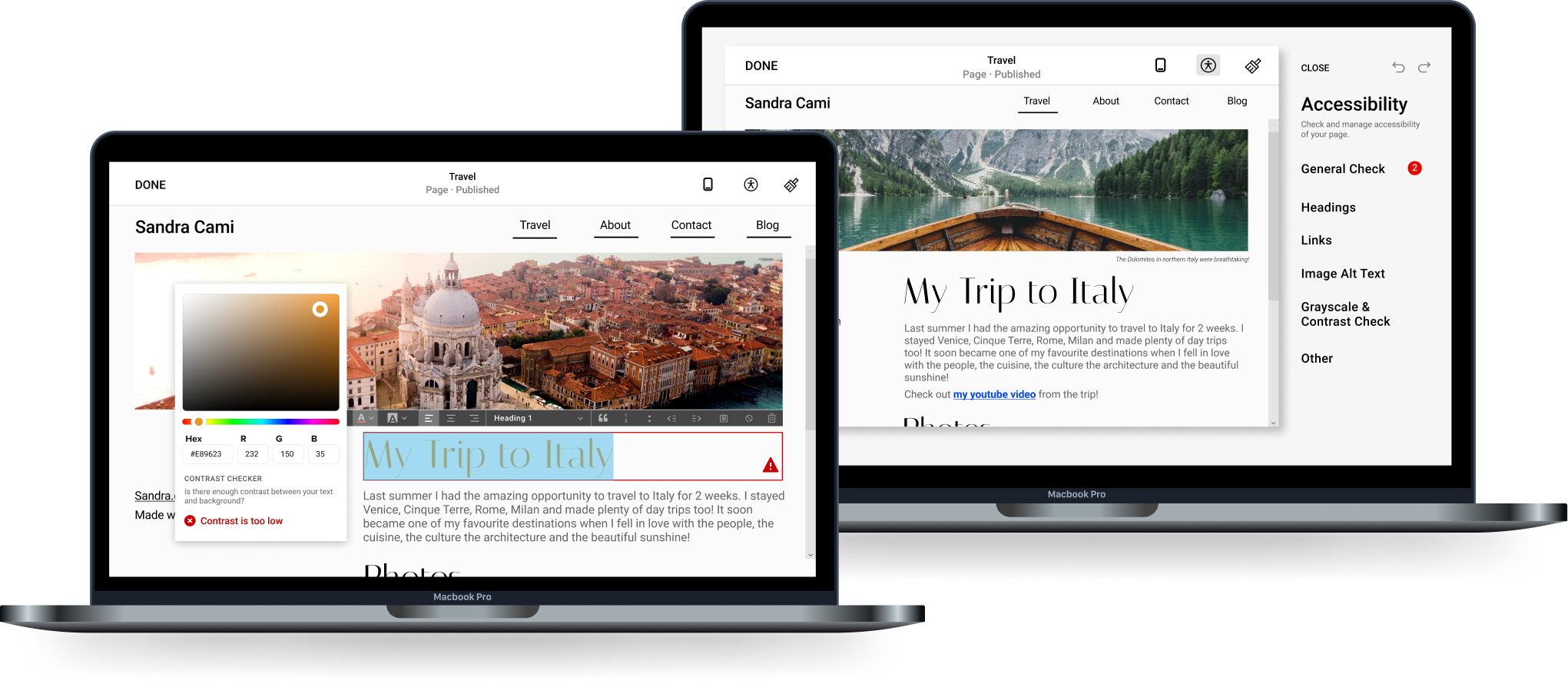
For example: Contrast Checker
Here the user is immediately notified of low contrast text. Then they are taken directly to the color picker to help correct it:
Another example: Alt Text Check
The user is notified of missing alt text and taken to Squarespace’s image settings:
3. Accessibility Panel
Thirdly, we centralized all accessibility fixes in one convenient panel, in line with Squarespace’s pre-existing design patterns.
For example: Final Check
If the user tries to publish changes, they are notified of any unresolved accessibility issues.
For example, here, the user still has remaining link issues on their “Travel” page.
Another example: Grayscale Checker
In the accessibility panel, the user may view their site in grayscale to check for colorblind acessibility:
USER RESEARCH & ITERATION
METHODS:
Due to limits on time, we tested our prototype on two users, walking them through a series of tasks and asking them to think aloud.
Both participants were sighted, aged 23-24 years old, with experience with Wix, Wordpress, and Weebly.
RESULTS:
“I did not know anything about accessibility or even we have that integrated in our phones or computer! Today is the first time I am hearing about this. This brings a whole other perspective of how they can use these features or even how I can benefit from these features as well.”
“I like how it provides error messages as a reminder to design my websites with accessibility. I have never encountered anyone with disability nor do I know how they access online services.”
The main categories of critical feedback we received were:
1. Reduce Technical Jargon
Since our participants did not have web development background, technical jargon such as “contrast ratio,” “heading level,” and “screenreader” were unclear without explanation. To address this, we simplified our explanations throughout the interface to be better understood by everyone.
For example, in the contrast checker, rather than including numerical information on the contrast ratio, we provide only the minimum necessary feedback for corrections:

2. Spread Accessibility Awareness
Despite prior experience with CMS, the participants had little knowledge about accessibility, due to lack of contact with screenreader users. To address this, we baked in videos showcasing how screenreader users would interact with site elements.
For example, in the heading levels checker, we add videos with a screenshot from an actual screenreader heading list.
NEXT STEPS
1. PRIORITIZE OTHER FEATURES
There are other common accessibility features we have yet to address, such as aria labels, form labels, etc.
2. EMPHASIZE THE HUMAN ELEMENT BEHIND ACCESSIBILITY
User research revealed that much of the public has never met someone who requires a screenreader, and therefore cannot visualize the struggles of a low-vision/blind user.
With more time, I would love to further explore other methods (interactive explanations, videos, etc) featuring real low-vision/blind users navigating a site, thereby (1) decreasing text, and (2) emphasizing the human struggle behind accessibility.
The aim is to showcase less of the technical HOW in accessibility, and more of the social WHY.
3. ACCESSIBILITY FOR CREATORS
Ultimately, to expand this project to a more powerful scope, we would step beyond accessibility for viewers only, redesigning the CMS entirely to allow screenreader users to build an online presence to market and express themselves.
REFLECTIONS
1. IMPORTANCE OF DIALOGUE WITH TARGET COMMUNITY
We did not want to walk in with a savior complex, believing that we sighted designers knew what was best for our main stakeholders in the low-vision/blind community.
Our project was built on pre-existing relationships with members of our community, and their insights played a core part in establishing the foundations of our project.
3. SOCIAL LAYER
Despite having participated in UCSD’s web accessibility project, I am wholly still learning (in fact I am certain my site still likely has accessibility issues despite having tried to fix most of them). This redesign was partially informed by my own experience (or inexperience) with web accessibility prior to joining UCSD’s web accessibility project.
With a design background, I knew the accessibility basics (alt text, contrast, etc), but had never interacted with someone using a screenreader, and therefore could not even begin to visualize what a screenreader interaction would look like.
Through the UCSD web accessibility project, Jimmy’s demonstrations made the “screenreader” a tangible concept, highlighting the barriers in navigating a web built for someone else (sighted users).
Moral: I don’t think I was alone in my lack of awareness around accessibility. This experience emphasized the importance of not only providing tools to learn from accessibility mistakes, but also experiences (either in real life, video, etc) that make the struggles of screenreader users more tangible to sighted users. Ultimately it’s about building empathy (and we are all still learning!)
(Also: Jimmy’s a champ.)
For Funsies
MORE ARTIFACTS
More artifacts from behind-the-scenes!
![Collaborating remotely with time zone differences, we made heavy use of asynchronous tools like Loom.]()
![Battle cries upon finishing our presentation]()
![Our Discord server, where we kept track of threads for design decisions, strategy, reflections, and more.]()
![Team Squarepants]()
![Our Figma screens, on their n-th iteration, organized by feature and stage in the user flow.]()


THANK YOU
TO JIMMY
For his major role and core insight to the low-vision/blind community
TO OUR TEST PARTICIPANTS
For their time and invaluable feedback
TO DESIGN CO & FJORD
For organization and sponsorship of Design Frontiers 2021
TO MY AWESOME TEAMMATES
For an awesome experience :)